Good Light Is Not Plenty of Light
Rasmussen and Gordon show that the direction of light and contrast matter more than the amount; Kahn shows that where the sun is harsh, glare control comes first.
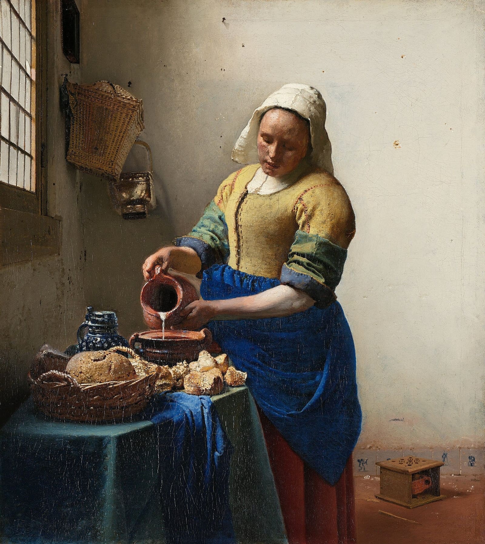
Photo: Johannes Vermeer, Het melkmeisje (The Milkmaid, c. 1660), public domain, via Wikimedia Commons
Try photographing a bowl of phở, the Vietnamese noodle soup. With the flash aimed straight at it, the bowl looks flat, losing both the steam and the gloss of the broth. Carry it over to a window in the morning, where the light comes from one side, and the bowl suddenly has volume and a cast shadow. The first setup may well have had more light.
Steen Eiler Rasmussen, the Danish architect, makes almost the same point in chapter VIII of Experiencing Architecture (Vietnamese edition 2007, chapter beginning on p. 209): many people think good light means a lot of light, while a good photographer keeps turning the lamp until form appears.
Two white walls and a corner
Two white surfaces meet at the corner of a room. If they are lit equally, the line of the corner disappears. Make one of them just a little darker and the corner shows. Light falling straight onto a wall gives little shadow and little texture; raking light is what brings out the bumps and hollows.
Gary Gordon, author of a textbook on interior lighting, arrives at the same place from another direction. According to him, we perceive the world through contrast, not through the amount of light entering the eye (Interior Lighting for Designers, 2003, ch. 1, pp. 3–10). A place where everything is equally bright feels like an overcast day, and tends to tire and depress people (ch. 2, pp. 11–24). He cites Flynn’s experiments: changing nothing but the lighting is enough to change impressions of a room’s spaciousness, clarity and comfort. There are not many experiments, so I treat this as a hypothesis rather than a law.
Gordon also analyzes a restaurant: the table that is the focus is bright, the other tables recede into the background (ch. 2 and 13). The picture of an office with fluorescent tubes covering the ceiling, or a café with a single lamp over each table, is my own comparison.
Moving the window to the corner
Rasmussen observes that merely moving a window from the middle of a wall to the corner changes the character of a room completely. A window beside a side wall lets light run along the wall, and if the reveal is cut at an angle, it becomes a reflector. He also points out a familiar mistake in classrooms: a row of main windows facing a row of high windows, so the seats along the wall end up dark.
A 17th-century Dutch house was narrow and deep because land was hard to come by, and received light only from the front and the back, so the window was divided into separate parts: a fixed pane of glass above, a shutter below. In good weather you open the lower shutter for the view. In bad weather the upper pane still gives enough light. In Vermeer’s paintings, a long window runs along the left wall with a white wall behind it, and we sense the whole room through light reflected onto objects.
I think our narrow, deep Vietnamese townhouses face exactly the same problem as the Dutch house; that is my own association, not Rasmussen’s. Pulling the lower half of the curtain and leaving the upper half open for light is also my own comparison.
Window height matters more than size
Gordon gives three compact points (ch. 5, pp. 51–62). One: the higher the window, the deeper the light reaches and the less glare it causes. Two: a beveled or rounded edge on the opening creates a zone of intermediate brightness between the bright pane and the wall next to it. Three: the usable depth of a room is about twice the height of the window head.
When the sun is too harsh
Gordon wrote for the temperate climate of the United States. In the tropics, shading has to come before admitting light; that is my own addition, not Gordon’s. Louis Kahn met exactly this problem when designing the American Consulate in Luanda, Angola (1959–62, not built). In the essay “Discussion in Kahn’s Office” (1961, beginning on p. 97 of Essential Texts), he noticed that a dark window surrounding a bright pane causes glare, and that wooden louvers or screens only add “glare points” against a dark background. The local people, for their part, work with their backs to the sun and take their light from the surface of the wall.
From this, Kahn placed a wall a few steps in front of the window and cut large openings in it so the view would not be lost. The face of the wall takes the sun and so reduces contrast. He tested it with a model, using a 500 W bulb. The weaknesses were also recorded: a separate wall is expensive, and Kahn himself thought the openings could be smaller.
A round opening at the top
The Pantheon in Rome is a closed circular room with a single opening at the top. The light comes from one source and has direction, so the shadows are real. The slanting sun falls as a cylindrical shaft, and the stone floor reflects light into the corners so that no corner goes black (Rasmussen, ch. VIII).
And the room you are sitting in: where does the light come from, and which corner is losing its edges?
Note. The information comes from books I consulted, together with my own discussion. The diagrams are my own drawings.