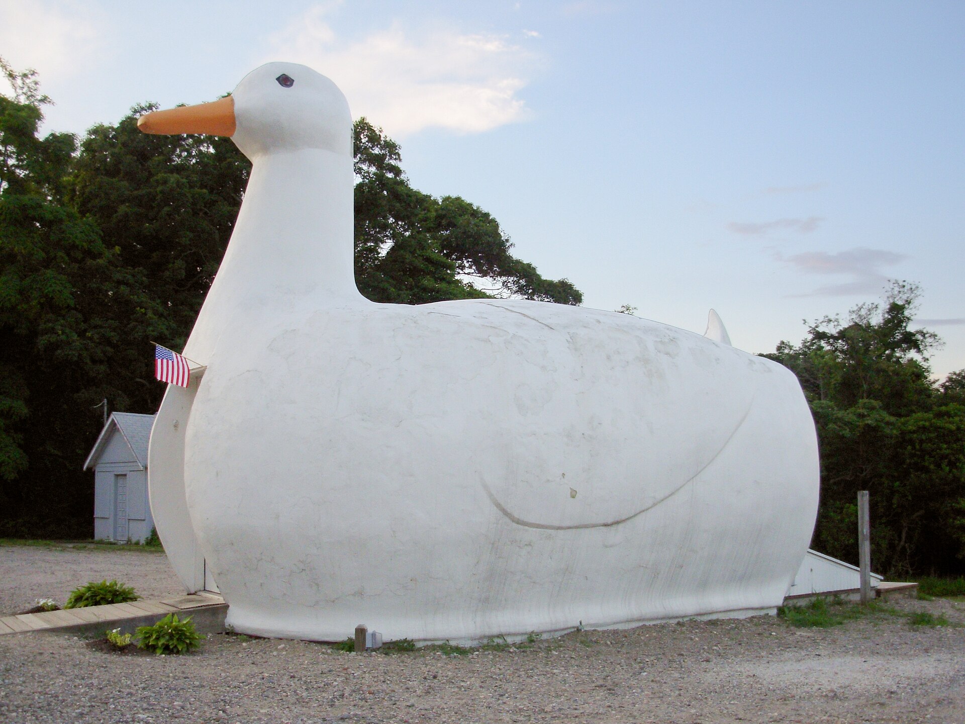
The Duck and the Shed with a Sign
Some buildings bend themselves into a shape that speaks; others stay a plain box and hang a sign out front. Venturi, Scott Brown, and Izenour called them the duck and the decorated shed, and showed that along a big road the symbol comes before the form.
Photo: Jemattox, CC BY-SA 3.0, via Wikimedia Commons
Picture yourself riding a motorbike down a stretch of national highway in Vietnam. From a few hundred yards away you can already read two bright red words, CƠM GÀ (chicken rice), on a sign twice as tall as the roof behind it. The restaurant itself is only a low row of tin-roofed sheds tucked in back. A little farther on, across the road, a cafe appears, molded into the shape of a giant teapot. This one needs no sign, because the whole building already is the sign.
I made this scene up as an example; it is not a memory. But those two roadside places match the two names that Robert Venturi, Denise Scott Brown, and Steven Izenour coined in Learning from Las Vegas (1972): the duck, and the decorated shed.
Two Ways for a Building to Speak Up
The book began as a studio at Yale in the fall of 1968, when three instructors took thirteen students to the Las Vegas Strip for ten days. In Part II (pp. 87–90), they sort buildings that want to say something to passersby into two kinds.
The first kind they call the duck. The name comes from a store built in the shape of a duck, which the book refers to as “The Long Island Duckling.” In a duck, the whole form is the symbol. The space inside, the structure, and the program all have to sink beneath that shape and get distorted to fit it.
The second kind is the decorated shed. This is an ordinary shelter, put up to serve directly whatever goes on inside. The symbol is applied separately on the outside: a sign, a front, a few pieces of ornament.
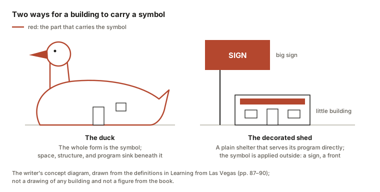
The three authors are clear that both ways are valid. Chartres Cathedral is a duck and a shed at once. The Palazzo Farnese in Rome is a shed. And Amiens Cathedral, as they see it, is a billboard with a building behind it.
| The duck | The decorated shed | |
|---|---|---|
| Where the symbol sits | In the form of the building itself | In the sign and the front applied outside |
| What happens inside | It has to bend to the shape | It stays square and easy to use |
| Examples in the book | The Long Island Duckling, a hamburger stand shaped like a burger | Palazzo Farnese, Guild House |
| Examples I made up | A teapot-shaped cafe | A tube house with a sign covering its second floor |
The last row of the table is mine. Vietnamese streets are already full of decorated sheds: every tube house that opens a shop is built about the same way, and people spot the pharmacy by the green cross on its sign, not by the shape of the house.
Big Sign, Little Building
The first part of the book explains the sign that is bigger than the restaurant by way of speed (pp. 6–18). In an old bazaar, shoppers walk right up against the stalls, and being close is enough to know who sells what. On the Las Vegas Strip, people sit in cars moving at about 35 miles an hour. At speed the field of vision narrows and the eyes fix on what lies ahead; the authors cite a study by Appleyard, Lynch, and Myer, in which more than half of what a driver sees is straight in front. To turn in on time, drivers have to read the place from a long way off.
So the sign has to be tall, big, and turned toward the oncoming cars, while the building sits back behind a parking lot. The book has a compact line for it: “The big sign and the little building is the rule of Route 66” (p. 13). They call this symbol in space before form in space. They add that if you took the signs away, there would be no place left.
Money follows the same logic. My reading notes record the image of a ten-thousand-dollar stand with a hundred-thousand-dollar sign: a sign costs less than bending a whole building.
Set this beside People Go Where People Are and the two books sit at opposite ends of one ruler. Jan Gehl measures a street in footsteps, so he notices the bench; Venturi’s group measures it in driving speed, so they notice the sign. That pairing is mine.
The Duck Hiding in Modern Architecture
This is where the argument starts to needle architects. The three authors hold that the duck is seldom right for our time, and yet Modern architecture is full of ducks. Their reasoning runs like this: when Modern architects threw out ornament, they unknowingly turned the whole building into an ornament, which is to say a duck (pp. 104–116). The book describes Mies van der Rohe fixing steel I-sections to the outside of his buildings. For the authors, those sections are ornament, there to talk about technology. They call this the symbolism Modern architecture uses and will not admit to (pp. 134–148).
To make the case, they put one of their own buildings into the comparison (pp. 90–103). Guild House by Venturi and Rauch (1960–63) and Crawford Manor by Paul Rudolph (1962–66) are both apartment buildings for the elderly, of about ninety units each. Guild House is built of dark brick to suit its street, uses familiar sliding windows blown up in size, and carries a large name sign. Crawford Manor has no ornament at all, shows rough concrete, and looks very advanced even though its frame is as ordinary as anyone’s. They label their own side “ugly and ordinary” and the other “heroic and original.” In their conclusion they land a hard blow: Modern architecture has been designing dead ducks.
Read It with a Cool Head
It is worth keeping some distance from the book. My notes point out that the authors picked that pair in order to win an argument, and that they are sometimes rough on Rudolph.
The decorated shed is also no blanket praise for every sign. The authors do warn that commercial advertising knows how to manipulate its audience. In the preface to the 1977 revised edition, Denise Scott Brown writes that the subject of the book is symbolism in architecture, with Las Vegas only as the case, and that the lesson is to be slower to sneer at other people’s taste. The book closes with Pugin’s warning: it is fine to decorate what you build, but do not build a decoration (pp. 162–163).
Try It on Your Own Street
Next time you are out, play this game on a familiar stretch of street, a hundred yards or so. Count how many ducks there are, and how many sheds.
Then cover one sign with your hand, or imagine the whole block with every sign taken down. Can you still tell which shop sells what? And the house you live in: what does it say to someone walking past, and does it say it with its shape or with something added on the outside?
Note. The information comes from books I consulted, together with my own discussion. The diagrams are my own drawings.