Wrong Compared to What?
On right, wrong and beauty in art: three different kinds of "right", four places where people have put beauty, and why "beauty is in the eye of the beholder" is only half true.
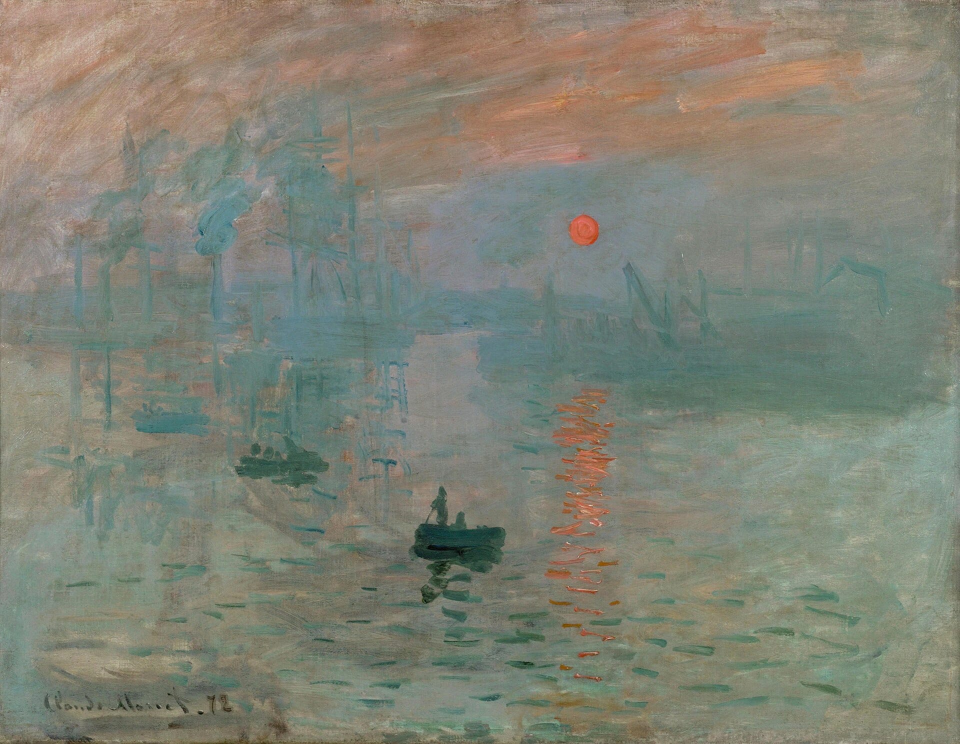
Photo: Claude Monet, Impression, Sunrise (Impression, soleil levant, 1872), public domain, via Wikimedia Commons
“Teacher, I drew it wrong.”
Anyone who has sat in a drawing class has heard this. A child points at a purple cat, or a tree taller than the house, and waits for the grown-up to rule. Grown-ups usually pick one of two answers. One is to correct: “cats aren’t purple, sweetheart.” The other is to reassure: “there’s no wrong in art.”
I think neither answer works. The first treats a drawing as a copy of the world and grades it on likeness. The second sounds generous, but if nothing can be wrong then nothing can be better, and the learner has no idea which way to go next.
The question worth asking back is: wrong compared to what?
Three kinds of “right”
When people say a drawing is right or wrong, they are usually using one of three yardsticks, and they often mix them up.
| Kind of right | The question | How to check | Examples |
|---|---|---|---|
| Right to the eye | Does it look like what we see? | Measure, compare proportions, draw perspective lines | A still-life sketch, a figure-drawing exercise |
| Right to the rules | Does it fit the conventions of its tradition? | Compare it with the habits of the genre | Dong Ho folk prints, calligraphy, altar paintings |
| Right to the intent | Does it do what it set out to do? | Look at its effect on the viewer | A caricature, a painting by Picasso |
Right to the eye is the easiest to grade. If the bottle in a figure-drawing exercise is three times as tall as it is wide, it has to be on paper too. A mistake here is a real mistake: it can be measured and fixed. Learners need this kind of right because it trains the eye.
Right to the rules is different. Dong Ho prints, a Vietnamese folk woodblock tradition, have no depth of perspective and no cast shadows, only flat areas of color inside black outlines. Judged by the “right to the eye” yardstick, The Mice’s Wedding is wrong almost everywhere. Yet nobody sees it as wrong, because it follows a different set of rules, and by those rules it is spot on. A Dong Ho print that added cast shadows to look more realistic would be the botched one.
Right to the intent is the hardest. In 1907 Picasso painted Les Demoiselles d’Avignon with faces like masks and bodies broken into planes. He could easily have drawn them true to life. He chose not to, because what he wanted to say did not lie in likeness. A story is often told about Matisse: a lady visitor complained that the arm of the woman in his painting was too long, and he replied that this was not a woman, it was a painting. I am not sure it really happened, but it says what needs saying.
So is the purple cat wrong or right? If the assignment was to draw the family cat as it looks, purple is off the brief. If the child wants to draw a sad cat, or a cat from a dream, purple may be the best choice in the whole picture. The grown-up can only find out by asking: “How do you want this cat to be?”
The rules change, so yesterday’s mistake becomes today’s right
The history of art is full of moments when something once judged wrong was later turned around.
In 1863 the jury of the official exhibition in Paris rejected so many paintings that a separate room had to be opened for the refused works. Manet’s Luncheon on the Grass was among them. In 1874 the journalist Louis Leroy took the title of Monet’s Impression, Sunrise to mock the whole group of painters as “Impressionists”. That mocking name later became the name of a school that almost everyone now finds beautiful.
It is easy to conclude that the public of the time was ignorant. I think it is closer to the truth that they were judging by an older set of rules. By the rules of academic painting, a canvas had to be smooth, the subject noble, the brushwork invisible. By those rules, Impressionist paintings really were wrong. The painters were not breaking the rules for fun. They put forward a different set, and viewers needed a few decades to learn it.
This also reminds us of the reverse: not everything that is mocked today will become a masterpiece. Most of the paintings rejected that year were forgotten, and rightly so.
Where does beauty live?
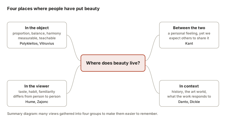
On to the second question. For more than two thousand years, people have tried placing beauty in four different places.
In the object
The ancient Greeks believed beauty was a matter of proportion. The sculptor Polykleitos is said to have written an entire book fixing how many heads make up the body, and what fraction of the hand a finger should be. The Roman architect Vitruvius demanded that a building be as well proportioned as the human body. If that is right, beauty can be measured, taught, and has an answer key.
This way of thinking is still alive in every book on composition. It is partly right: many things we find beautiful really are well balanced. But it stumbles at once on a lopsided ceramic bowl that everyone loves to pick up. The golden ratio, often treated as the formula for beauty, is also less solid than its reputation: from Fechner’s experiment in 1876 to today, studies disagree about whether people really prefer it.
In the viewer
In the 18th century David Hume pushed the other way: beauty does not sit in the object, it is a feeling that arises in the viewer. The saying “beauty is in the eye of the beholder” has its root here.
But Hume did not stop there, and this is the part people tend to skip. He retells an episode from Don Quixote. Two connoisseurs taste a barrel of wine. One says the wine is good but with a hint of leather, the other says a hint of iron. The whole village laughs at them. When the barrel is emptied, an old key tied to a leather strap is found at the bottom.
Hume’s point: taste is personal, but some people taste more finely than others. According to him, a good judge needs five things: delicate senses, plenty of practice, many comparisons between works, freedom from prejudice, and a clear head. He adds one more test, which is time: what many generations and many cultures have cherished together is unlikely to be just a passing fancy.
Between object and viewer
Kant, writing in 1790, noticed something very ordinary in the way we speak. When we like a dish, we say “I like this dish” and don’t bother arguing if you don’t. But before a sunset we say “how beautiful”, not “beautiful to me”. And if the person beside us shrugs, we feel slightly let down, as if they were missing something.
For Kant, this is exactly what is peculiar about judgments of beauty. They start from our own feeling and cannot be proved by any rule, yet we speak as if everyone ought to agree. He also held that this liking must be disinterested: we find a painting beautiful not because it is expensive, because it belongs to a friend, or because it matches the sofa in the living room.
In context
In 1917 Marcel Duchamp sent a porcelain urinal, signed “R. Mutt”, to an exhibition in New York. It was not displayed. Nobody called it beautiful, Duchamp included. Yet more than a century later people are still discussing it.
The philosopher Arthur Danto met the same puzzle in 1964, when Andy Warhol showed wooden boxes printed to look exactly like supermarket soap cartons. If the eye cannot tell an artwork from a commodity, what makes it art? Danto’s answer: something the eye cannot see, namely knowledge of art history and of the question the work is answering. George Dickie put it more bluntly: an object becomes an artwork when the art world (artists, museums, critics, the public) puts it in a place where it is to be seen as one.
This view explains contemporary art, but it is easily criticized as circular: art is whatever the art world calls art. And it says nothing about whether a work is good or bad.
Does art have to be beautiful?
Duchamp’s urinal shows one thing: “art” and “beautiful” parted ways long ago.
In fact they parted even earlier. In 1757 Edmund Burke distinguished the beautiful from the sublime: storms at sea, deep chasms and the night sky overwhelm us and frighten us a little, and that is exactly why we are drawn in. At the end of the 19th century Tolstoy set beauty aside altogether. For him, art is one person passing on to another a feeling they have lived through, and a good work is one that manages to pass it on.
Picasso’s Guernica, painted in 1937 after the bombing of a Spanish town, is not beautiful in any comfortable sense. The horse screams, the mother holds her dead child, and everything is black, white and gray. Calling it “beautiful” sounds almost tactless. Yet few would say it is not a great work. Here the yardstick of “right to the intent” does better than the yardstick of “beautiful”.
Looking in another direction, Tanizaki wrote in 1933 that the Japanese look for beauty in shadow and in the marks of time: lacquer glimmering dimly by candlelight, silver that has tarnished. That beauty is almost the opposite of Greek brightness and balance. It shows that even the word “beautiful” does not have a single meaning.
Or is beauty just familiarity?
Psychology has a few findings that make art lovers a little uneasy.
Robert Zajonc (1968) showed participants meaningless shapes a varying number of times. The shapes seen more often were liked more, even though the participants did not remember seeing them. James Cutting (2003) tested the same idea on Impressionist paintings. He found that students preferred paintings reproduced often in books over those reproduced rarely. When he had a class see the lesser-known paintings regularly over a whole semester, the gap shrank sharply. Part of what makes a “masterpiece” seems to be that it gets seen a lot.
Reber, Schwarz and Winkielman (2004) offered an explanation: we feel pleasure in what the mind processes fluently, such as symmetrical, sharp or familiar shapes. Daniel Berlyne (1971) pointed to the other side: too familiar is boring. We like best what lies in between, strange enough to leave something to explore, familiar enough that we don’t get lost.
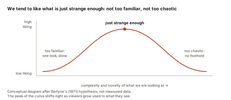
I don’t think these results “expose” beauty. They only explain why the rules can change: the more we look, the more the “just strange enough” point drifts, and what dazzled the eye yesterday has become easy on it today. They also fit with Hume. A well-trained judge is exactly someone who has looked long enough to see what is good in things that still look confusing to a newcomer.
So how do we answer the child?
To sum up, here is what I would dare to say.
Right and wrong are real, but they always come with a “compared to”. Compared to the eye, to the rules of a genre, or to what the work set out to do. Most arguments about a painting happen because two people are holding two different rulers.
“It depends on the person” is only half true. Feeling is our own. But the eye can be trained, and people who have looked a lot and compared a lot usually see more. Liking and judging are two different things: I can dislike a painting and still see that it does very well what it set out to do.
Beauty has no single definition. It has at least four homes, and each definition explains some cases and stumbles on others. I find it more useful to use all four as four questions than to pick one.
Art does not have to be beautiful. It can frighten us, make us think, make us uncomfortable, and still be good.
As for the child and the purple cat, instead of a verdict I would try three questions:
- What do you want this picture to do, or to tell?
- Where in the picture does it already do that?
- Where does it not yet, and what else could we try?
These three questions also work when we stand in front of a painting in a museum and don’t know what to think. They are close to an idea I wrote about in my essay on verbs: instead of asking what a painting is, beautiful or ugly, ask what it is doing. Peter Zumthor says something similar about buildings in the essay on the Vals baths: don’t try to make beauty, do exactly what needs doing, and beauty comes by itself.
The art historian Ernst Gombrich opens his best-known book with the line: “There really is no such thing as Art. There are only artists.” There is no capital-A Art with a single rulebook. There are only people, each trying to do something, and the viewer’s job is to find out what.
References
- Berlyne, D. E. (1971). Aesthetics and psychobiology. Appleton-Century-Crofts.
- Burke, E. (1757). A philosophical enquiry into the origin of our ideas of the sublime and beautiful.
- Cutting, J. E. (2003). Gustave Caillebotte, French Impressionism, and mere exposure. Psychonomic Bulletin & Review, 10(2), 319–343.
- Danto, A. C. (1964). The artworld. The Journal of Philosophy, 61(19), 571–584.
- Dickie, G. (1974). Art and the aesthetic: An institutional analysis. Cornell University Press.
- Fechner, G. T. (1876). Vorschule der Aesthetik. Breitkopf & Härtel.
- Gombrich, E. H. (1950). The story of art. Phaidon.
- Hume, D. (1757). Of the standard of taste. In Four dissertations.
- Kant, I. (1790). Kritik der Urteilskraft (Critique of the Power of Judgment).
- Reber, R., Schwarz, N., & Winkielman, P. (2004). Processing fluency and aesthetic pleasure: Is beauty in the perceiver’s processing experience? Personality and Social Psychology Review, 8(4), 364–382.
- Tanizaki, J. (1933). In’ei raisan (In Praise of Shadows).
- Tolstoy, L. (1897). What Is Art?
- Zajonc, R. B. (1968). Attitudinal effects of mere exposure. Journal of Personality and Social Psychology, 9(2, Pt. 2), 1–27.
Note. The information comes from books I consulted, together with my own discussion. The diagrams are my own drawings.